
Vacation sunscreen logo: The design, story, and brand identity behind Vacation

SwappaHome Editorial Team
Home Exchange & Slow Travel Editorial
Key Takeaways The Vacation sunscreen logo is more than a label mark: it helps establish a playful, nostalgic visual world around sun care and leisure. The…
Key Takeaways
The Vacation sunscreen logo is more than a label mark: it helps establish a playful, nostalgic visual world around sun care and leisure.
- The design draws on retro holiday and editorial cues.
- Lettering, color, and packaging work together as one visual system.
- Official packaging and brand channels are the safest logo references.
- Product details should be checked before buying from a marketplace seller.
- Responsible logo use preserves clarity, accuracy, and brand ownership.
What the Vacation sunscreen logo represents
The Vacation sunscreen logo presents sun care through a deliberately upbeat lens. Rather than feeling clinical or purely functional, its visual direction connects the product with leisure, travel, and the pleasure of being outdoors. The result is a mark that feels like part of a larger holiday story.
The brand’s nostalgic visual direction
The visual language associated with the Vacation sunscreen logo draws from retro editorial design and the polished optimism of older leisure advertising. Condensed serif lettering, decorative details, borders, and tactile paper-like effects are among the cues associated with this direction. These references make the identity feel collected from a particular cultural mood rather than generated from a generic beach image.
Nostalgia works here because it is specific enough to be recognizable but open enough for viewers to complete the story themselves. A familiar type treatment or slightly old-fashioned layout can suggest poolside magazines, resort brochures, and sun-faded ephemera without reproducing any one historical advertisement.
How the logo supports the vacation theme
A logo supports a vacation theme when it does more than name the product. It should make the surrounding object feel suited to a trip, a beach bag, or a slow afternoon outside. The lettering becomes a small invitation to adopt a mood before the sunscreen is even applied.
That is why the mark matters across bottles, tubes, and campaign images. Repetition helps the same feeling travel from the shelf to a bathroom counter and then into a holiday photograph. For readers planning the wider journey, these travel planning guides offer a useful reminder that visual details often become part of how we remember a destination.
The role of humor and retro-inspired branding
Humor keeps the retro references from becoming stiff or overly precious. The surrounding brand world has been described through playful fictional workplace and resort ideas, allowing ordinary sun-care communication to sound knowingly theatrical. The logo benefits from that tone because it feels less like a solemn badge and more like an invitation into a shared joke.
Retro-inspired branding also creates room for contrast. A sunscreen can be practical while its identity remains witty, colorful, and a little exaggerated. The visual joke is part of the welcome, not a replacement for the product information a shopper still needs.
Key elements of the Vacation sunscreen logo
The logo is easiest to understand as one part of a coordinated packaging system. Type, color, spacing, imagery, and surface treatment all affect how the wordmark is read. Looking at those pieces together gives a more useful picture than isolating the lettering alone.
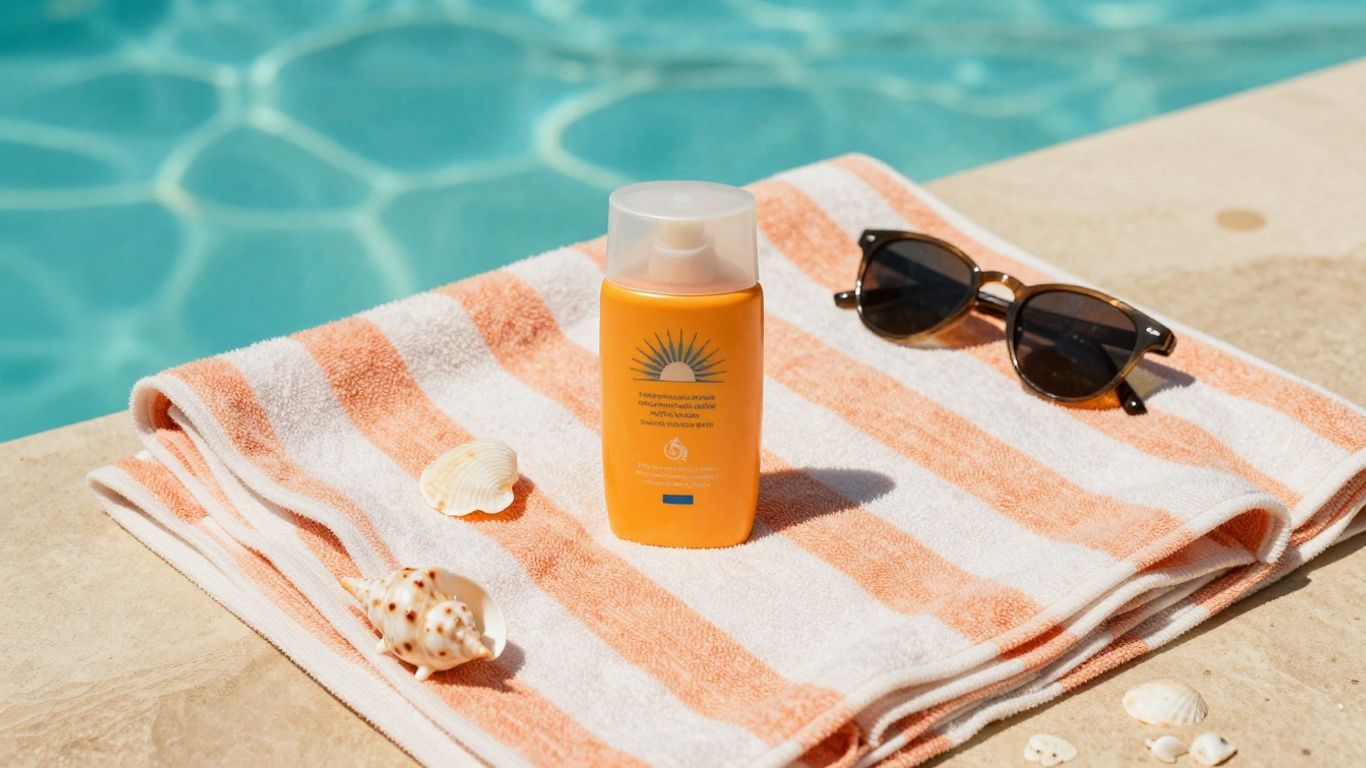 Retro sunscreen packaging beside summer accessories
Typography, lettering, and wordmark style
Typography gives the Vacation sunscreen logo much of its personality. Serif forms can suggest print culture and older advertising, while condensed proportions make a wordmark feel compact and poster-like. Decorative italics or contrasting type styles can add movement without requiring a complicated symbol.
The important feature is consistency. When the same lettering approach appears across several formats, it becomes a visual shortcut for the brand. Even at a glance, shoppers can begin to recognize the family resemblance between products.
Color choices and summer associations
Color carries the emotional work that type cannot do alone. Warm tones can recall sunlight, terracotta, fruit, or vintage paper, while cooler accents may suggest water, shade, and open sky. The strongest palettes usually balance brightness with enough contrast for the product name and directions to remain readable.
A useful way to assess a palette is to separate its mood from its function. Mood comes from the color relationships; function comes from whether the label remains legible in bright retail lighting or a crowded travel bag. Both matter, especially when a design wants to feel carefree without becoming difficult to use.
Packaging details that complement the logo
Packaging gives the wordmark a physical setting. Borders, unusual spacing, illustrations, surface textures, and small copy details can make the logo feel native to the object rather than pasted on afterward. These elements are especially effective when they repeat a retro print sensibility across the whole package.
The following table shows how each layer contributes without treating any single detail as the entire identity:
| Packaging layer | Visual contribution | Practical effect |
|---|---|---|
| Wordmark | Establishes the primary name cue | Supports quick recognition |
| Color palette | Sets a warm, seasonal mood | Helps products feel related |
| Borders and textures | Adds editorial and tactile character | Creates a distinctive shelf presence |
| Supporting copy | Extends the playful tone | Gives context around the product |
The table also explains why a logo rarely works in isolation. Remove the surrounding colors, spacing, and material cues, and the mark may lose much of the atmosphere that made it memorable.
Where to find the Vacation sunscreen logo
The most dependable logo references appear where the brand controls the presentation. Packaging, official digital channels, and carefully prepared press images tend to show the mark in its intended proportions and context. Search results and resale listings can be useful for discovery, but they deserve more scrutiny.
Official product packaging and labels
Start with the physical product when you need to see how the logo functions in everyday use. The front label shows its relationship to the product name, while the sides and back reveal how much space is reserved for ingredients, directions, warnings, and other required information. A clean reference should show the complete package rather than a cropped detail.
The official product presentation is also the best place to compare recurring design features. Look at placement, scale, color, and the relationship between the wordmark and the rest of the label instead of judging a logo from one low-resolution image.
The brand’s website and social media channels
Official digital channels are useful for seeing the logo across campaigns, product pages, and seasonal imagery. They may show alternate crops or layouts, but those variations should still feel connected through typography, color, and spacing. The Vacation sunscreen page provides broader background on the product’s retro editorial direction and its leisure-oriented creative world.
Social posts can be particularly revealing because they place the mark in motion: beside a pool, within a styled still life, or against a travel-themed visual. Treat those posts as context for the identity, not as permission to download and reuse every asset.
Retail listings and press materials
Retail pages and press materials can help locate product shots, but the quality of the source varies. A press image may be professionally color-corrected, while a marketplace photograph may be dim, compressed, or altered by a seller. When the logo is the subject of an article, preserve the source information and distinguish an official image from an editorial reconstruction.
A simple source trail makes the research easier to trust. Record where an image came from, when it was accessed, and whether the visible package matches the current product presentation.
How to identify an authentic Vacation sunscreen product
Logo recognition can help a shopper notice inconsistencies, but it should not be the only test of authenticity. Packaging changes, regional labels, and product updates can all create legitimate differences. The safest approach is to compare several visible details and buy through a reliable channel.
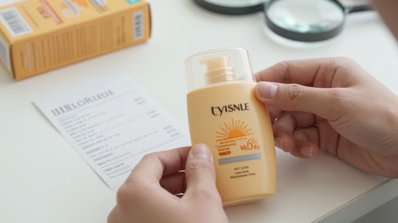 Sunscreen bottle inspected beside a retail receipt
Checking the logo and packaging quality
Begin with the overall print quality. Edges should look intentional, colors should not appear strangely muddy, and the wordmark should not be stretched, blurred, or awkwardly placed. A single imperfect photograph is not proof of a counterfeit, but several unexplained irregularities deserve caution.
Also check whether the logo sits naturally within the package design. Mismatched type, inconsistent spacing, or a label that looks like a separate sticker can be warning signs, particularly when paired with vague seller information.
Comparing product names, sizes, and label details
Product names and sizes provide a more concrete comparison than mood alone. Read the full front label, then compare directions, ingredient information, and other required details with an official reference. Small differences can be meaningful, but they should be interpreted alongside the package date and the seller’s explanation.
A compact review can follow this order:
- Confirm the exact product name.
- Compare the stated size and format.
- Check directions, warnings, and ingredient text.
- Review the seller, photographs, and return policy.
This sequence keeps the logo in perspective. It is a useful visual clue, while the label details provide the fuller basis for deciding whether a listing deserves confidence.
Avoiding misleading marketplace listings
Marketplace listings often use attractive brand imagery without making the seller’s relationship to the product clear. Be wary of stock photographs paired with incomplete descriptions, unusually pressured shipping language, or prices that are difficult to explain. Reviews can help, but they are not a substitute for checking the package itself.
If the product arrives and the physical item does not match the listing, photograph the discrepancy before opening or using it. That record can help with a return and prevents an uncertain product from being treated as an authoritative logo reference.
How the logo strengthens Vacation’s brand identity
A strong logo gives a product line a repeatable visual anchor. In sun care, where many packages compete for attention in the same few seconds, that anchor can make the difference between a passing glance and recognition. Its value grows when the rest of the brand world respects the same tone.
Creating recognition across sunscreen products
The wordmark can create continuity across different sunscreen formats. A shopper may encounter a lotion, spray, or accessory at separate times, yet repeated typography and packaging cues can make the products feel related. That consistency builds familiarity without requiring every item to look identical.
Recognition is strongest when the mark remains clear at multiple sizes. A large package image can carry decorative detail, while a small social avatar or shelf view needs a simpler, more immediate read.
Connecting fragrance, packaging, and lifestyle marketing
Sun care is experienced through more than protection claims. Scent, texture, color, and the setting in which a product is photographed can all shape the impression it leaves. The Vacation identity has been associated with a signature scent and a tropical-paradise sensibility, so the logo participates in a wider sensory and lifestyle presentation rather than standing alone.
That connection gives the packaging a role before, during, and after a trip. It can look at home in a bathroom, a beach tote, or a carefully arranged travel photograph while retaining the same recognizable name cue.
Standing out in the sun-care category
Distinctiveness does not require visual noise. A clear wordmark paired with a committed period-inspired direction can stand apart from packages that rely only on conventional clinical signals or generic beach imagery. The identity feels intentional because its details appear to belong to the same imagined world.
A useful rule follows: memorable branding should still leave room for practical reading. The strongest shelf presence combines personality at a distance with legibility up close.
How to use the Vacation sunscreen logo responsibly
Using a recognizable logo in an article, review, or design study calls for care. Readers should be able to tell whether an image is official, editorial, illustrative, or user-created. Clear sourcing protects the audience from confusion and keeps the discussion focused on the design rather than an accidental implication of endorsement.
Understanding trademark and brand-use considerations
A logo may function as a trademark or other protected brand asset, so ownership and permission should be considered before publication. Commentary, criticism, news reporting, and educational discussion can raise different questions from advertising or commercial merchandising. The safest practice is to check the brand’s current usage guidance and, when needed, request permission.
Do not imply that a brand approved an article simply because its mark appears in it. A short caption identifying the product and image source can provide useful context without making a claim about affiliation.
Choosing approved logo assets for editorial content
When an official press kit or media resource is available, use the supplied asset rather than tracing a screenshot or downloading a random marketplace image. Preserve the original proportions, colors, and clear space. If no approved asset is available, a properly credited package photograph may be more transparent than a recreated vector mark.
Editorial images should also serve the reader. Crop tightly enough to make the logo visible, but keep sufficient packaging context to show what the image actually depicts. That balance supports accuracy without turning the article into an advertisement.
Avoiding alterations that could misrepresent the brand
Avoid recoloring, stretching, redrawing, or combining the logo with unrelated marks. Even a well-intentioned redesign can suggest a product variation, partnership, or official campaign that does not exist. If an alteration is necessary for analysis, label it clearly as a visual study and keep the original reference nearby.
Responsible use is ultimately a matter of precision. Show the mark as it appears, describe what can genuinely be observed, and separate design interpretation from claims about ownership, approval, or product performance.
Conclusion
The Vacation sunscreen logo works because it joins a readable name with a larger visual mood built from nostalgia, leisure, humor, and carefully coordinated packaging. Studying its type, color, placement, and context reveals why a simple wordmark can carry so much brand identity, while careful sourcing and responsible use keep that study accurate.
Frequently Asked Questions
What makes a sunscreen logo memorable?
A memorable sunscreen logo usually combines clear lettering with a distinctive visual tone, consistent placement, and packaging details that are easy to recognize at a glance.
Why do retro designs work well for summer products?
Retro design can recall travel posters, poolside advertising, printed postcards, and other familiar leisure references. Those associations give a product an immediate emotional setting.
Should a logo be judged separately from its packaging?
It can be examined separately for letterform and proportion, but its full impact depends on color, spacing, imagery, material, and the surrounding product information.
How can shoppers compare two sunscreen packages?
Compare the exact product name, size, directions, warnings, ingredient information, package quality, seller details, and photographs rather than relying on the logo alone.
Are marketplace product images always reliable?
No. Images may be outdated, reused, compressed, or unrelated to the item being shipped. Official product pages and clear photographs of the actual package are generally stronger references.
Can a logo be used in a design article?
Possibly, depending on the purpose, jurisdiction, image source, and surrounding use. Credit the source, avoid implying endorsement, and seek permission for promotional or commercial applications.
What should an editorial logo image include?
It should show enough of the original package or source context to make the reference clear, while avoiding edits that change the mark or suggest an unofficial product variation.

Published by
SwappaHome
SwappaHome Editorial Team
Home Exchange & Slow Travel Editorial
The SwappaHome Editorial Team brings together travel research, home-exchange community insights, and platform data to produce practical guides for first-time and experienced home swappers. Every article cites real platforms, current market rates, and verifiable city-level facts so readers can make informed decisions without guessing.
Ready to try home swapping?
Join SwappaHome and start traveling by exchanging homes. Get 7 free credits when you sign up!